Poland, 30 August, 2024
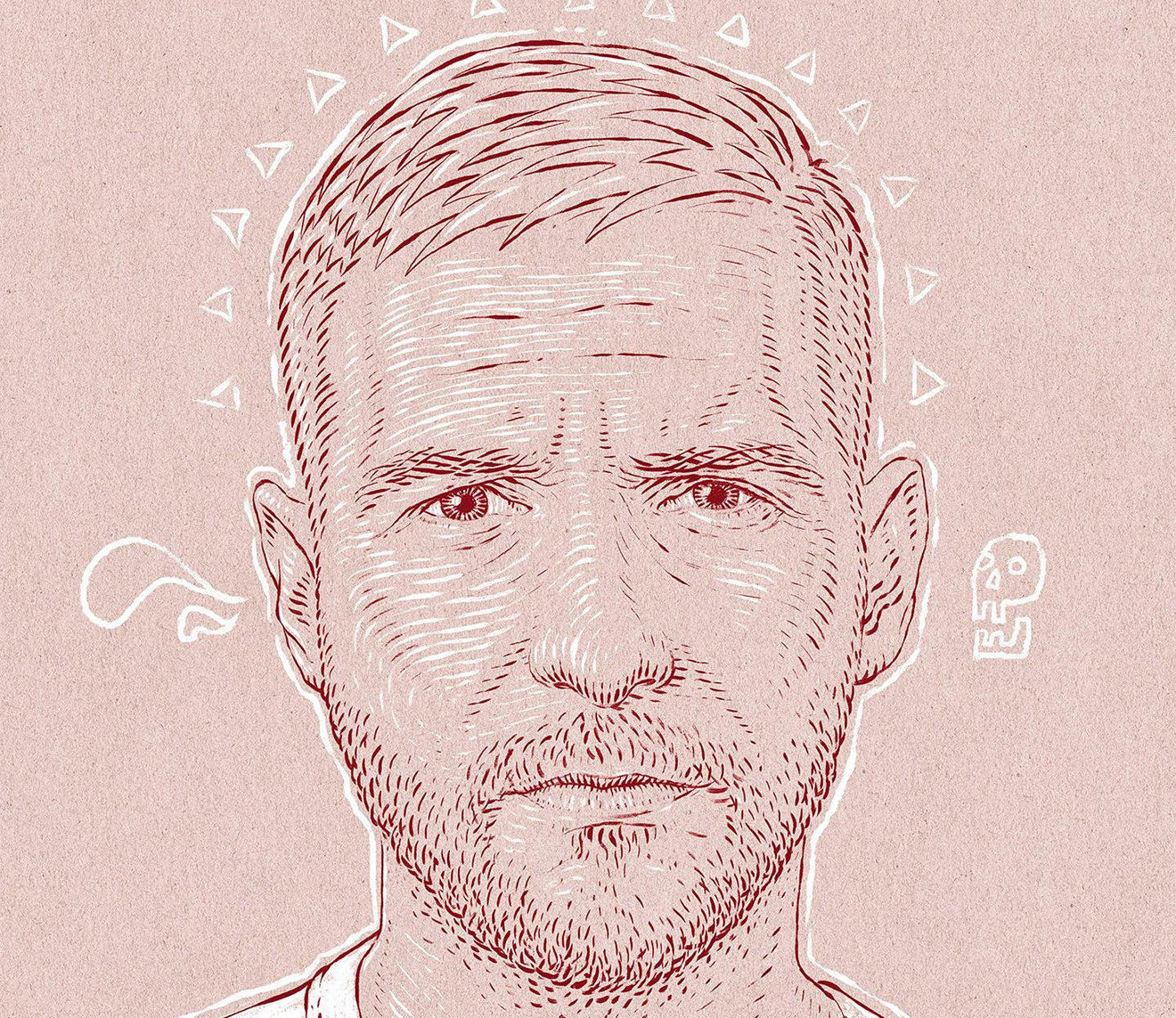
Bartosz Kosowski, born in 1979, is an illustrator and poster artist based in Łódź, Poland.
He studied at the Strzemiński Academy of Fine Arts and Design, focusing on traditional printmaking techniques such
as woodcut, etching, mezzotint, and lithography. For the past twenty years, he has been creating award-winning posters, editorial illustrations, and portraits, with clients like Apple, Netflix, Campari, Bank of America, The Washington Post, and many more.
Tell us about your projects?
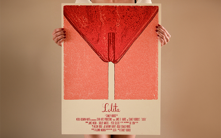
The first one is my Lolita poster I created back in 2014 for Stanley Kubrick’s show at Spoke Art Gallery in San Francisco. The piece is very loosely based on the original from 1962 in which Sue Lyon is depicted in her heart-shaped glasses and a lollipop but, unlike the original piece, it is much more symbolic and metaphorical. The piece happened to become very popular, and it has received lots of recognition from the industry: among others, it got me two gold medals from the Society of Illustrators New York and Los Angeles, a Bronze Award at the European Design Awards, ended up in plenty of poster and illustration exhibitions and was featured in a Bloomsbury coursebook on the theory of illustration.
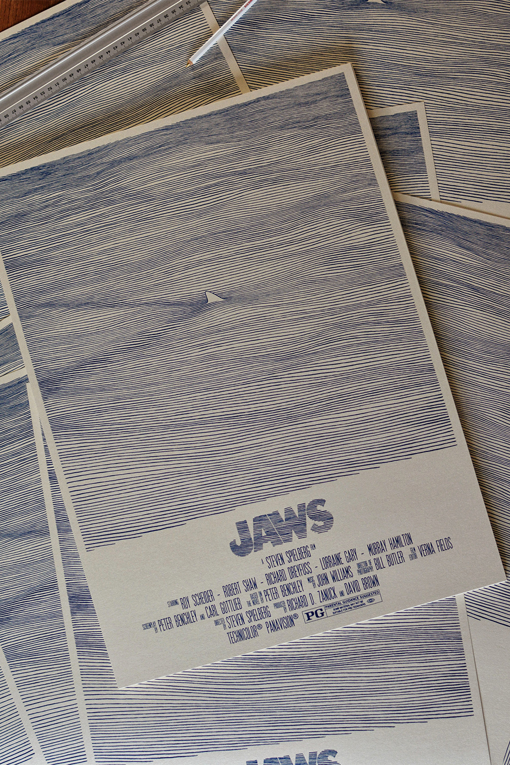
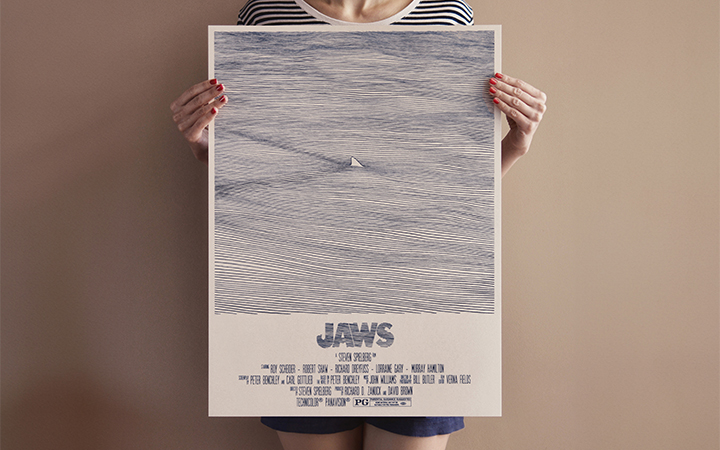
The second poster is my “Jaws” screenprint. When I got down to drawing it, I wanted to do something that would be different from the iconic Rogel Kastel poster. The truth is that the original poster for “Jaws” is probably one of the most well-known movie posters of all time, and it has been ripped off, parodied, and paid tribute to in all possible ways. So, instead of drawing inspiration from this amazingly striking and violent image, I decided to create something that would somehow juxtapose it – instead of showing the monstrous shark ready to devour the swimmer, I focused on the calmness of the ocean and showed only the fin of the shark while leaving everything that is scary hidden underwater. I just thought that things would be more terrifying if you couldn’t see them and let your imagination do the job. This particular piece took me about a year to finish and the reason why the creative process was so long is that I had to redraw the poster a couple of times as I wanted to get the fluidity of water spot on even though I used the hand-drawn lines only. I think I got it quite right the third time when I drew 202 solid lines which do not touch one another and printed it as one-colour screenprint. The fun fact is that the piece ended up on one of the walls at Universal Studios a few months after it was released.
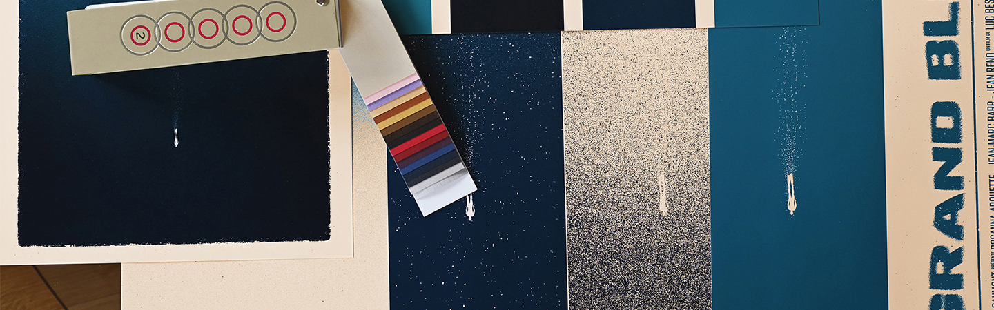
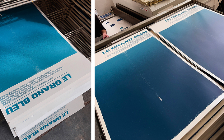
Finally, there is “Le Grand Blue”, which is my most recent poster. I saw this film for the first time as a kid, and I have always liked it so much that I decided to pay tribute to it 36 years later. Again, I wanted to use simple minimalist imagery to convey the essence of the film. I thought it would be good to play with the scale again and hence, I went for a tiny lone diver in a vast and expansive ocean, which is meant to capture the depth, solitude, and existential journey that defines the film.
The tough part with the print was to get the screen-printed gradient of blues right as the transition here is very subtle and I wanted to keep it this way. Fortunately, my friends at Reprint (a screenprinting studio based in Wroclaw, Poland, that I often work with) did an amazing job on that and the piece has already received some recognition – it got to 3x3 Illustration Annual and was selected to appear in American Illustration 43.
What inspires you?
As I come from Poland, I suppose I have been somehow influenced by the “Polish Poster School” of the 1960s. I really like the posters of Waldemar Swierzy, who used smudges, dots and splashes to create works that look really crazy or even abstract, when examined up close in detail.
However, when you look at his works from a distance, you can appreciate the clear composition and – in a way – realistic feel to them. Apart from Swierzy I really like “Vertigo” by Roman Cieslewicz, “Wozzeck” by Jan Lenica, Stephen Frankfurt’s “Rosemary’s Baby” or – to choose something more contemporary – Vasilis Marmatakis’ “Lobster”. I also love the works of Saul Bass and I always try to create my posters bearing in mind what he said about designing: “It is almost impossible to remember and retain something unless one has an emotional or intellectual involvement with it.”
What does paper mean to you?
Paper is extremely important to me. I studied traditional printmaking and specialized in etching and aquatint, so I am particularly passionate about paper. I believe the paper you choose has a significant impact on how a design or illustration appears in the real world.
What are you up to right now?
I am currently finishing a series of portraits for the Wall Street Journal and also negotiating two movie poster projects for upcoming Polish films.